Making the big difference for people with sight loss.
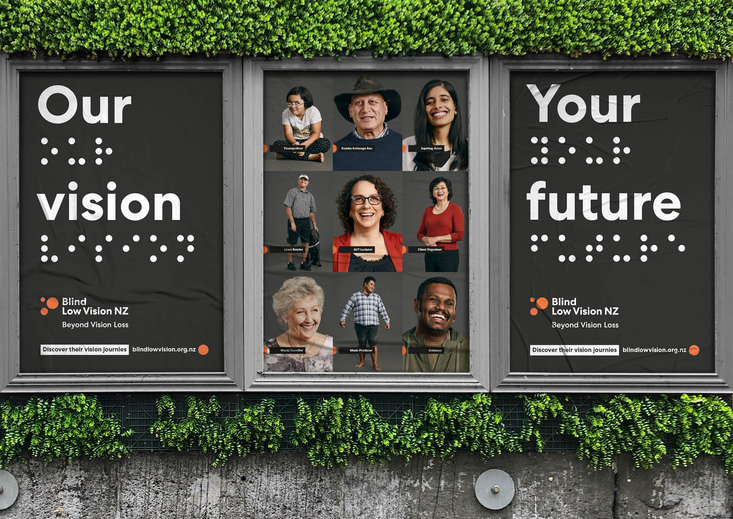
The Blind Foundation had a perception issue. Many believed it was only for the totally blind. Yet the organisation provides services for a wide range of clients, from low vision through to those with complete sight loss—enabling them to live their lives with self-reliance and confidence. It needed to reach a wider range of Kiwi. The existing brand identity also didn’t meet accessibility standards for their clients.
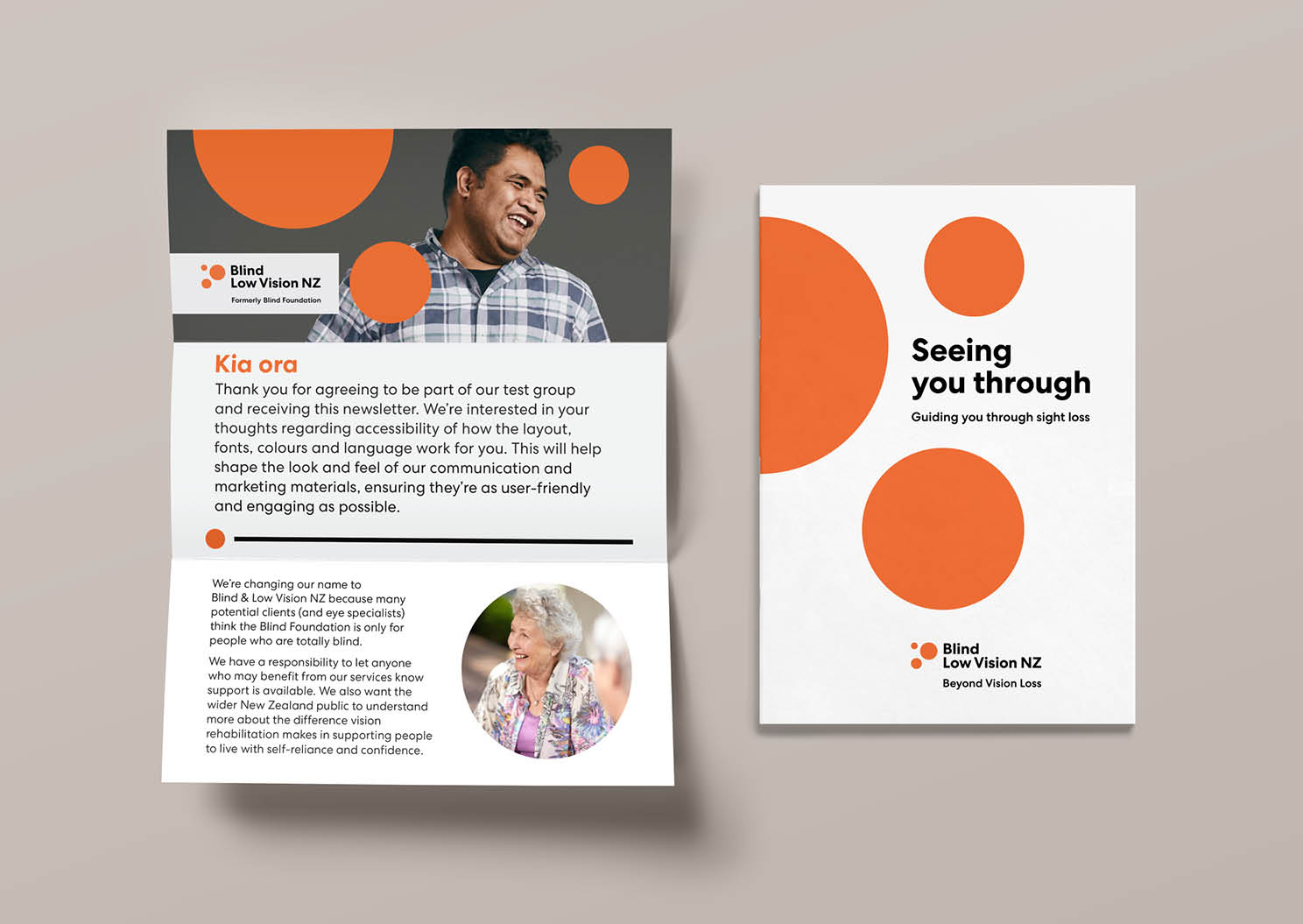
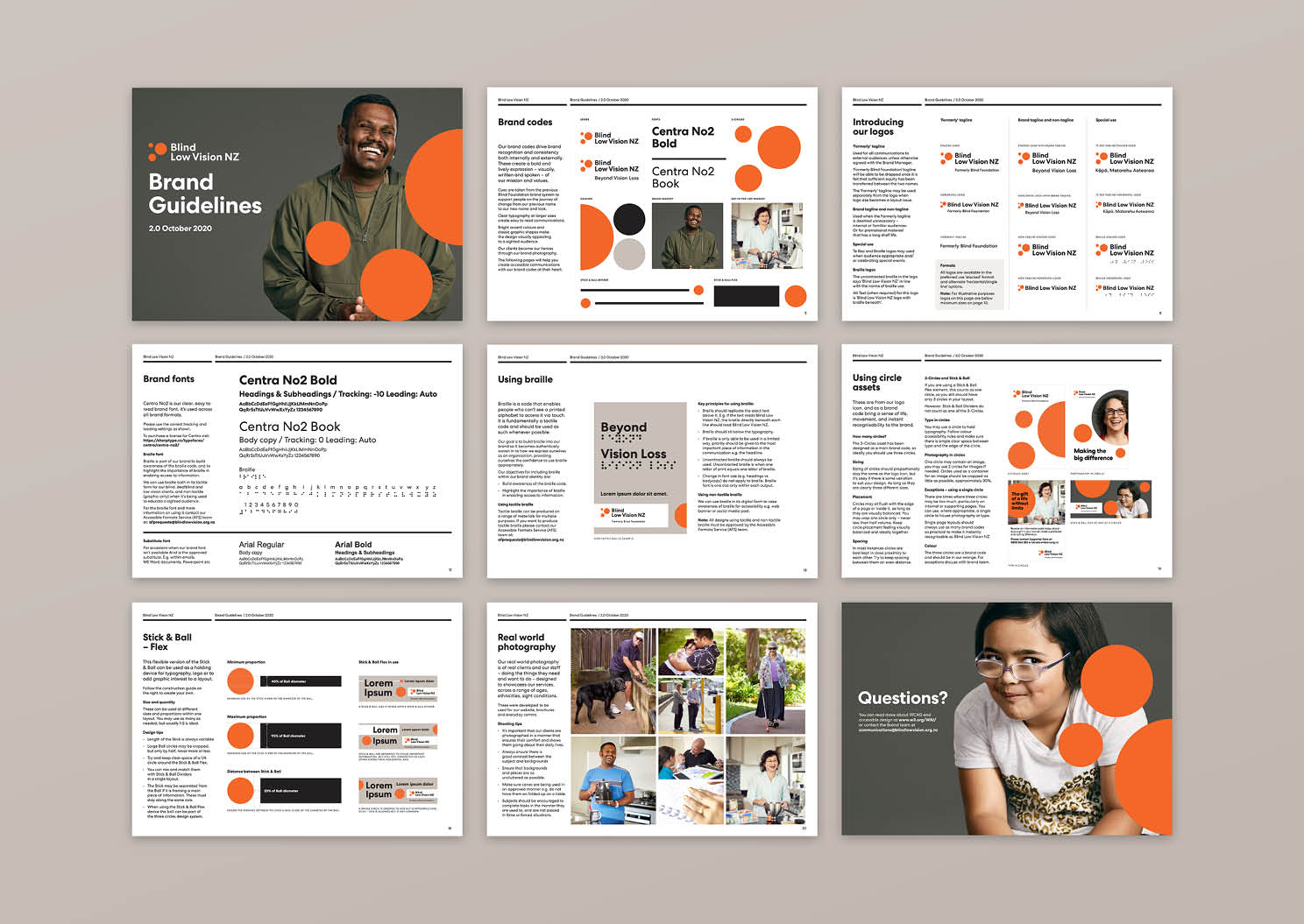
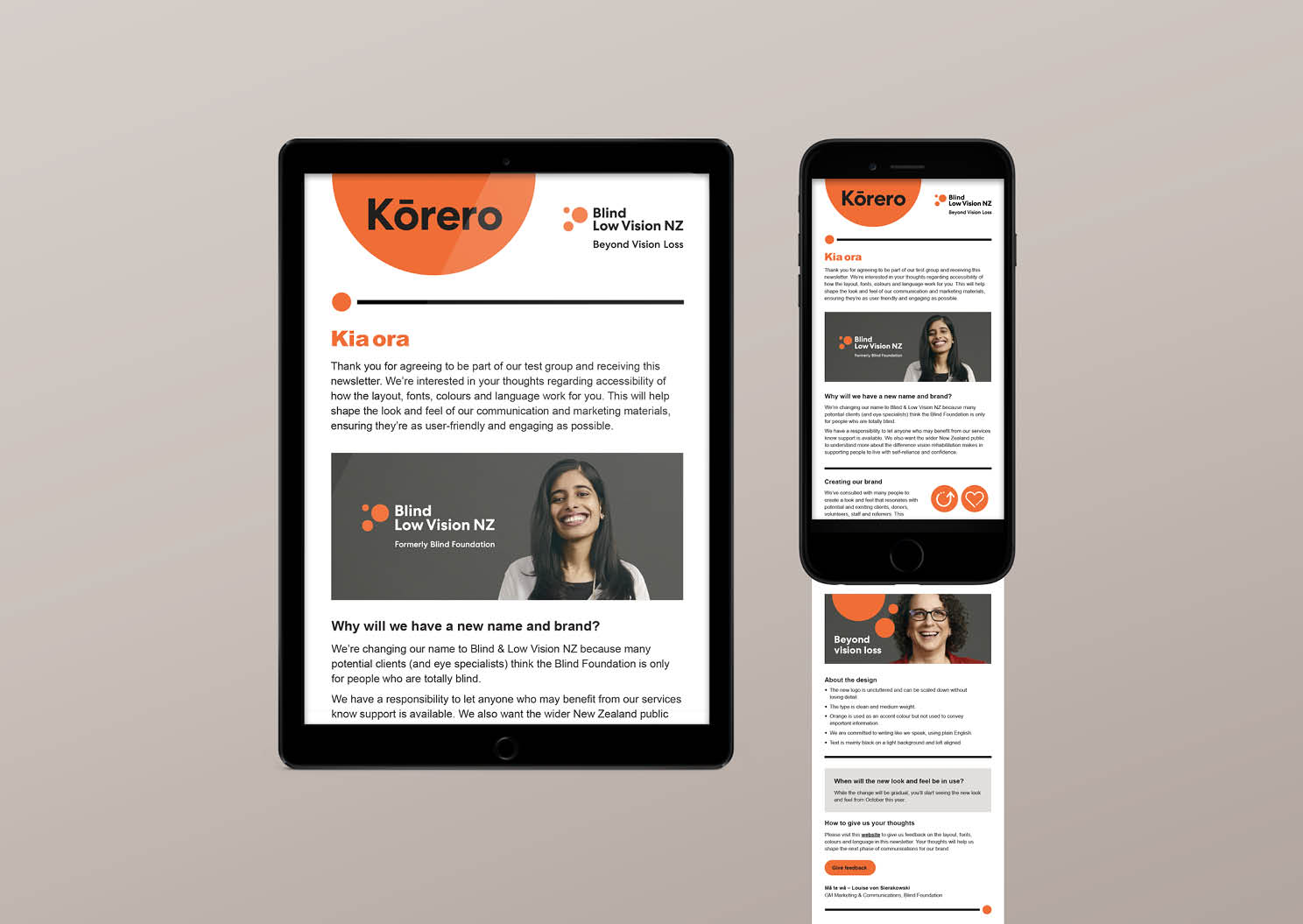
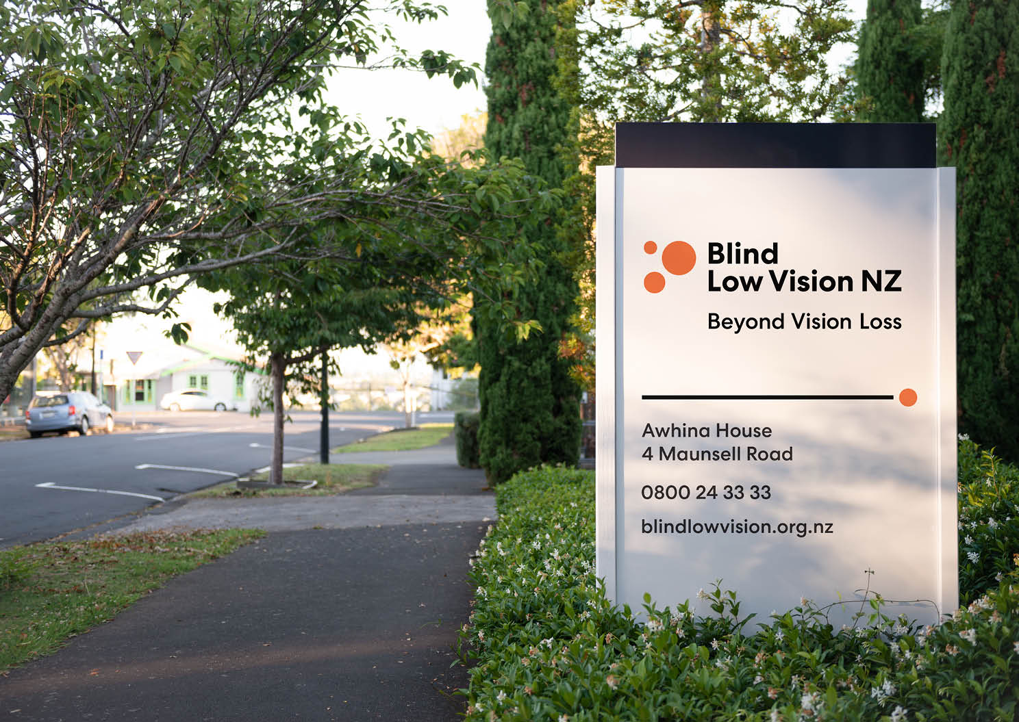
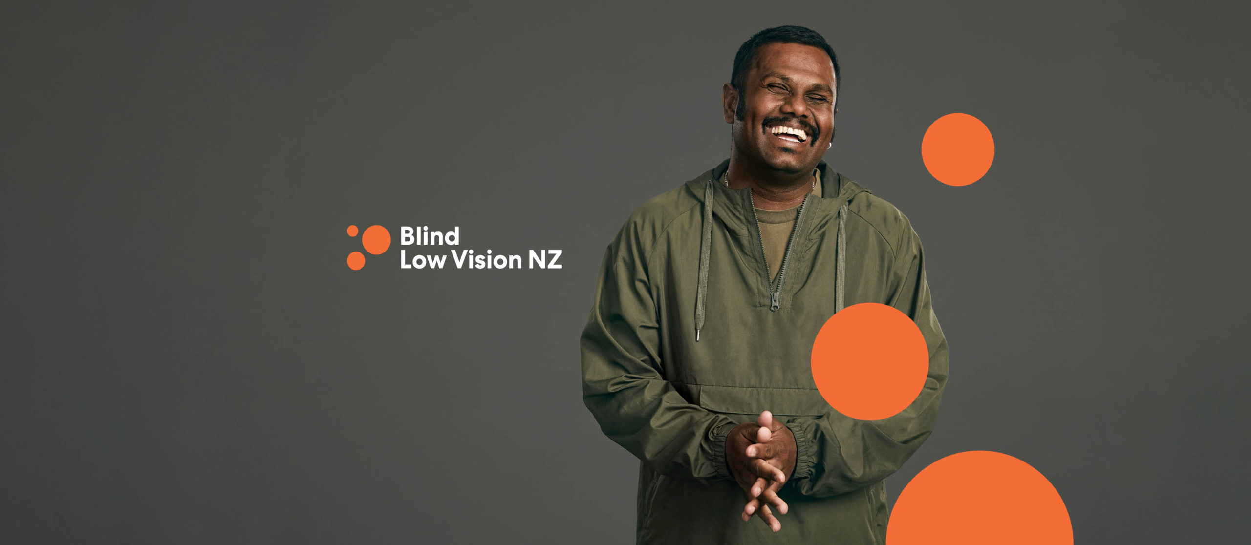
After strategy and story development we undertook nationwide stakeholder consultation to define the new name. This directly addressed the perception issue. The identity was then developed following WCAG AAA and best practice accessibility guides. This threw up some challenges but ensured maximum user functionality for people with sight loss. While a fresh look was required to signal change, the three-dot graphic system (part inspired by braille and tactile paving) and use of orange provide continuity with the former logo.
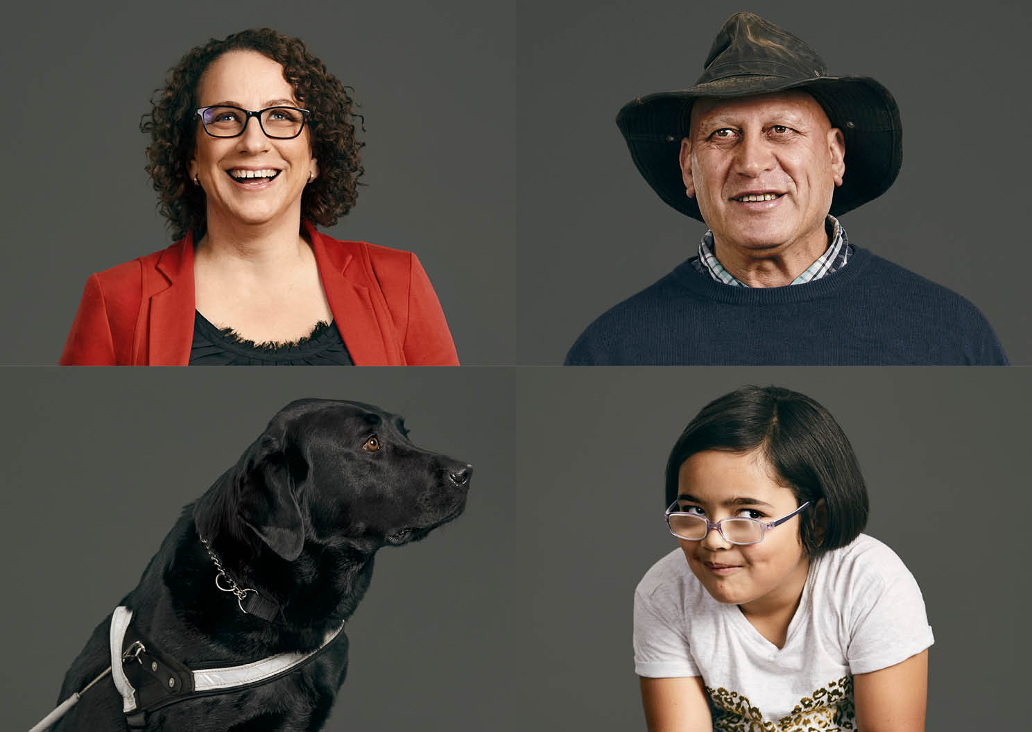
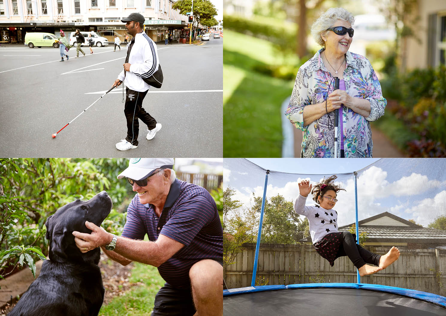
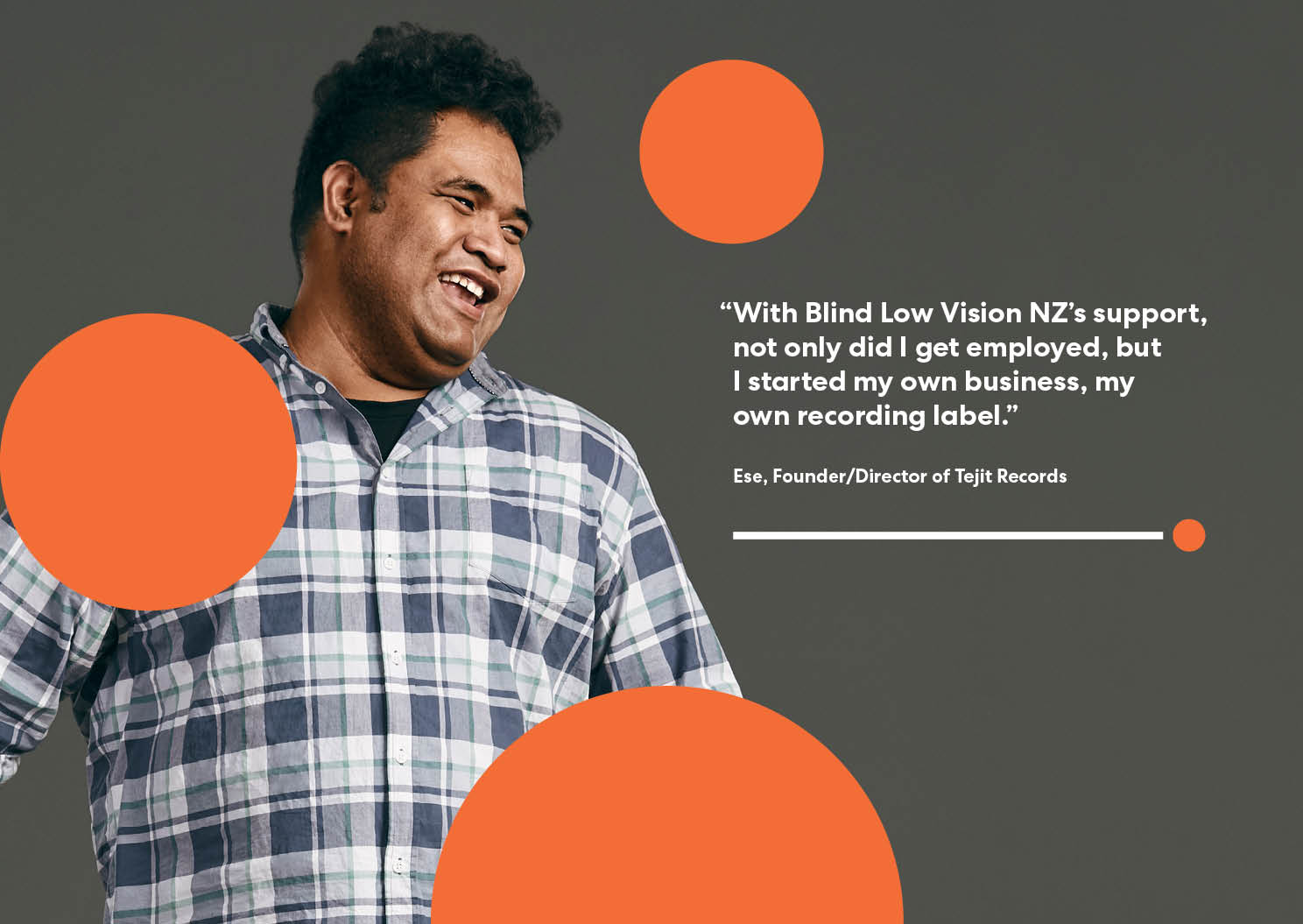
Expressive portrait photography by Stephen Tilley was shot to help reflect the inspiring stories of the organisation’s clients. This combines with the overall brand system to communicate an uplifting and optimistic feeling.
Blind Low Vision NZ is leading the way in vision rehabilitation services, advocating for accessibility and contributing to New Zealand’s eye health awareness. Now it has a name and visual identity to communicate this more effectively.