A global brand built on local partnerships.
Turners & Growers is New Zealand’s leading fresh produce grower, distributor, and exporter.
They’re a 120-year old, billion-dollar turnover company with a global footprint and multiple brands in different markets.
It was time to develop a singular brand identity to reflect its scale and celebrate the importance of their partnerships. They needed an identity that retained the New Zealand heritage of the organisation in the domestic market, while also strengthening their presence in global markets.
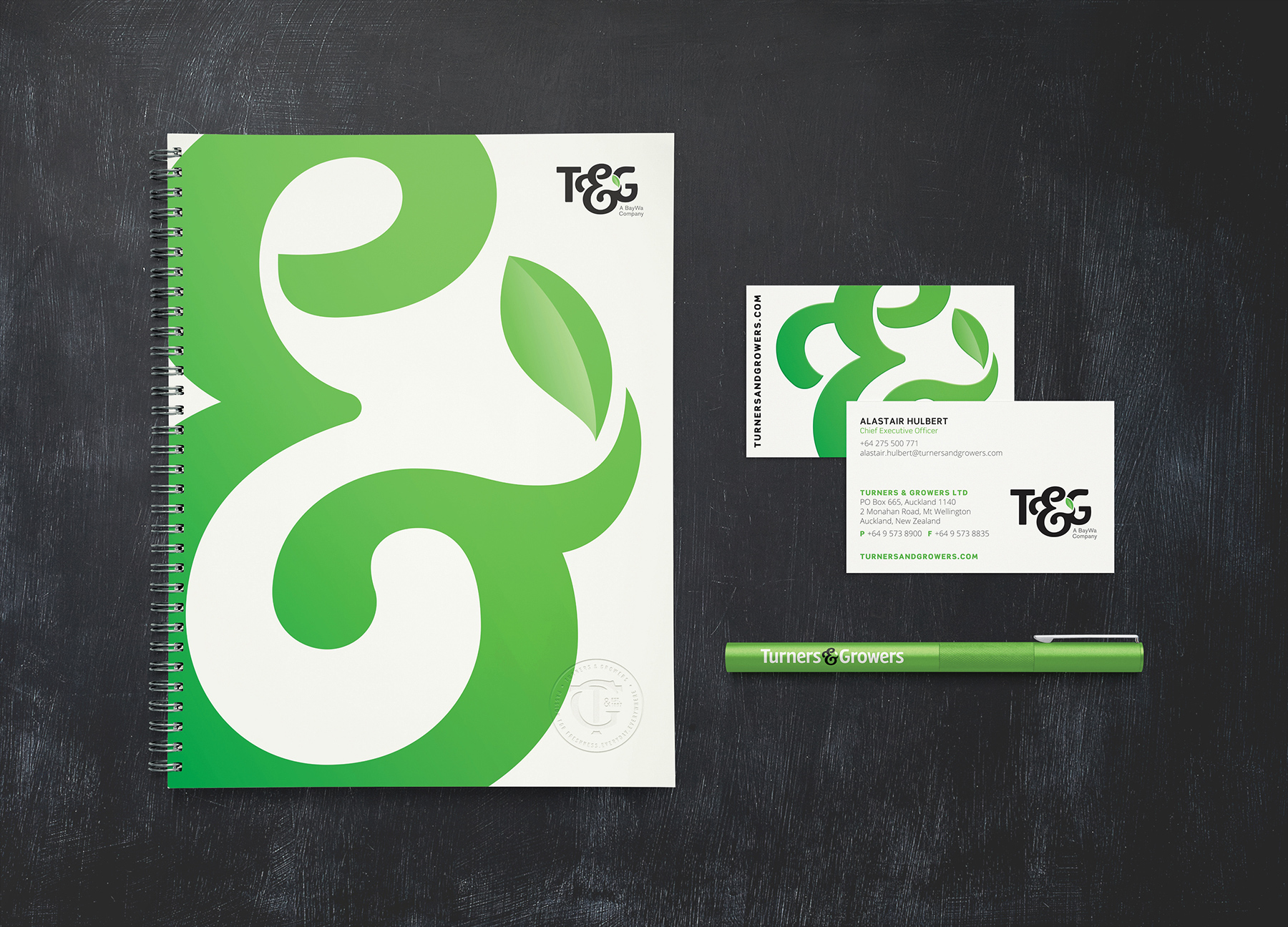
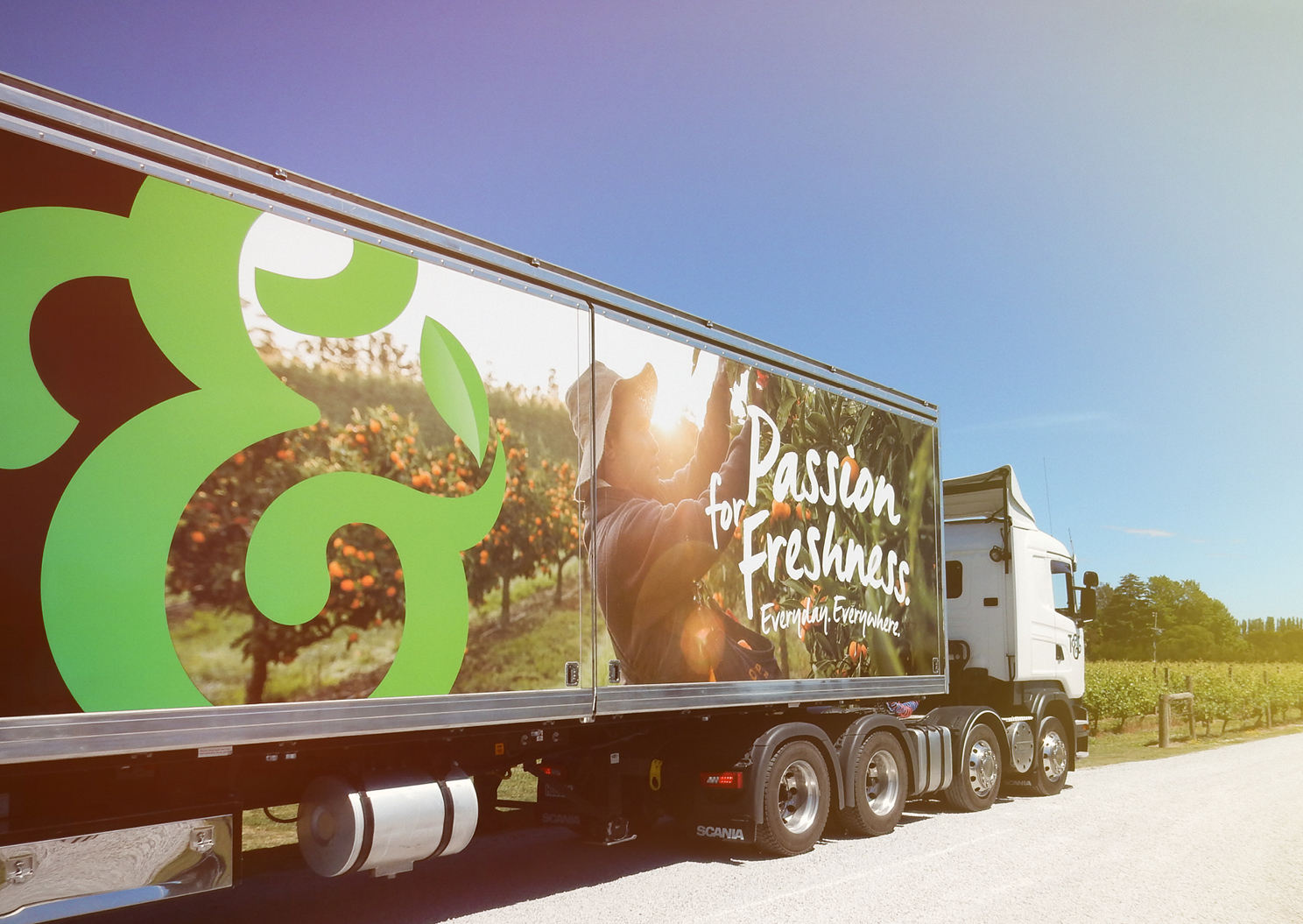
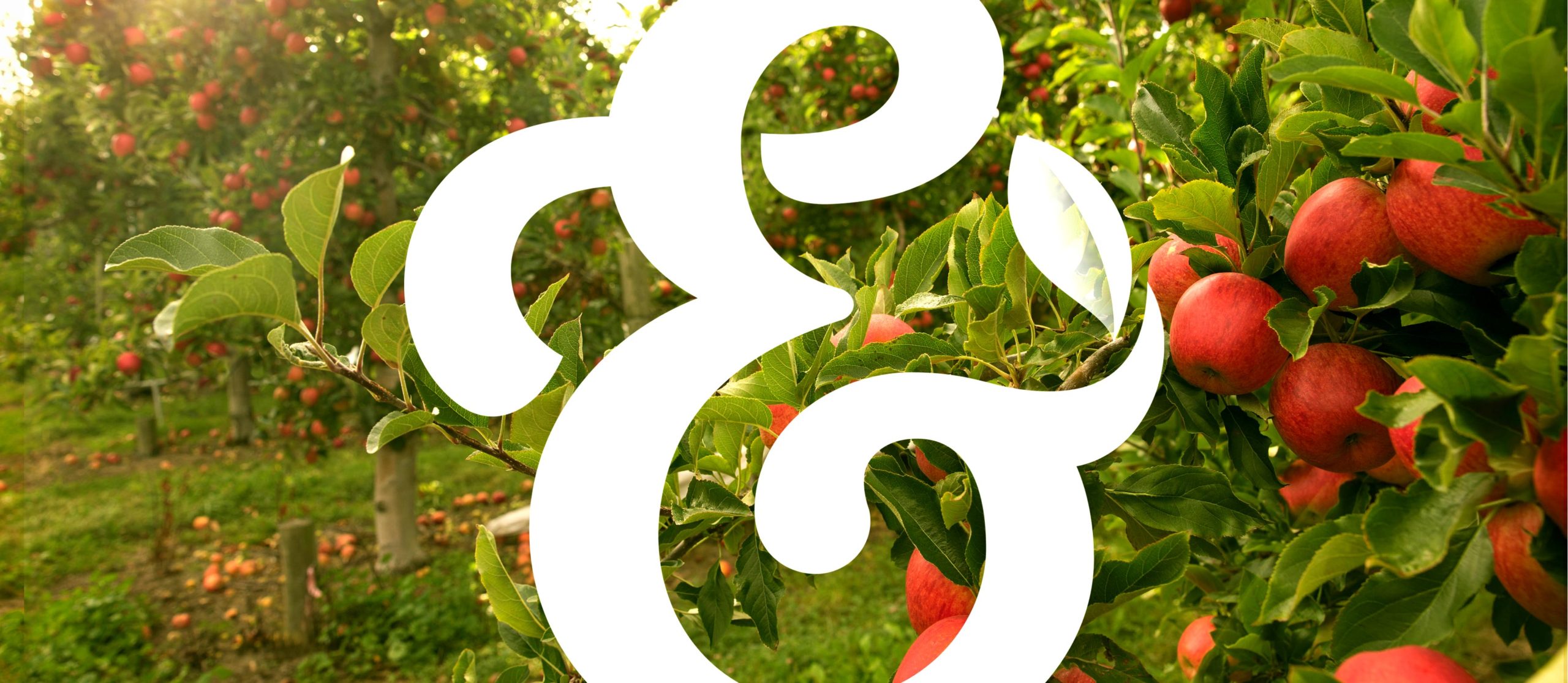
We scaled the name Turners & Growers back to T&G – as producers and customers already referred to them. The emphasis on the ampersand reflects the importance of relationships between growers, customers, and staff.
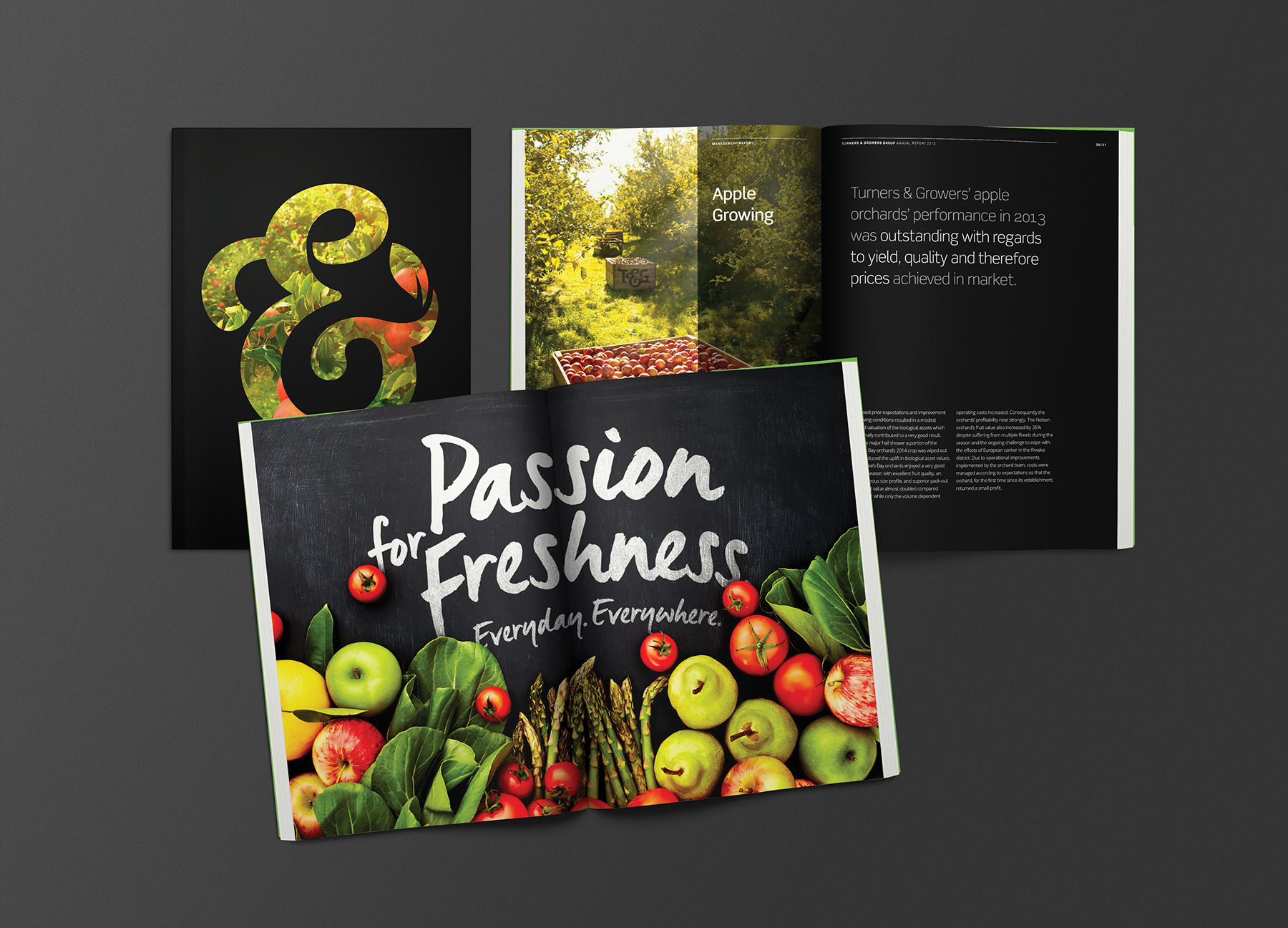
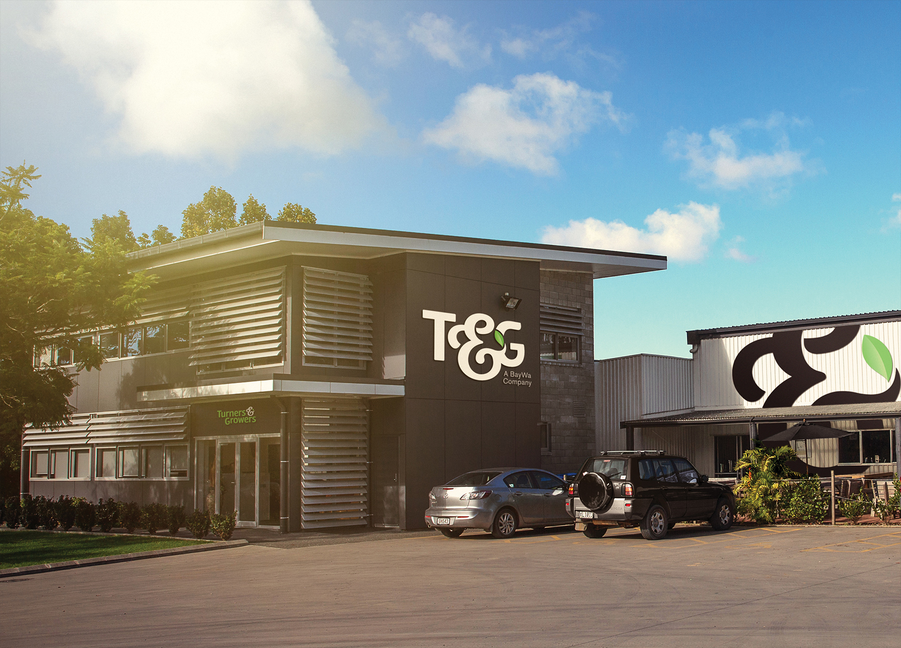
The koru gives a nod to T&G’s New Zealand roots, while the green leaf reflects their fresh produce and continued ambitions for growth. Using black contrasts, the imagery style calls to mind the land – overall creating a globally awarded, world-class identity that truly reflects T&G’s ‘Passion for Freshness’.
The brand identity was awarded a distinction at the Rebrand awards in 2016.
![]()